The
right
color

every
time.

Sip is a modern color picker that brings ease to color organization and team collaboration.

Try Sip for Free

🍃 No credit card required

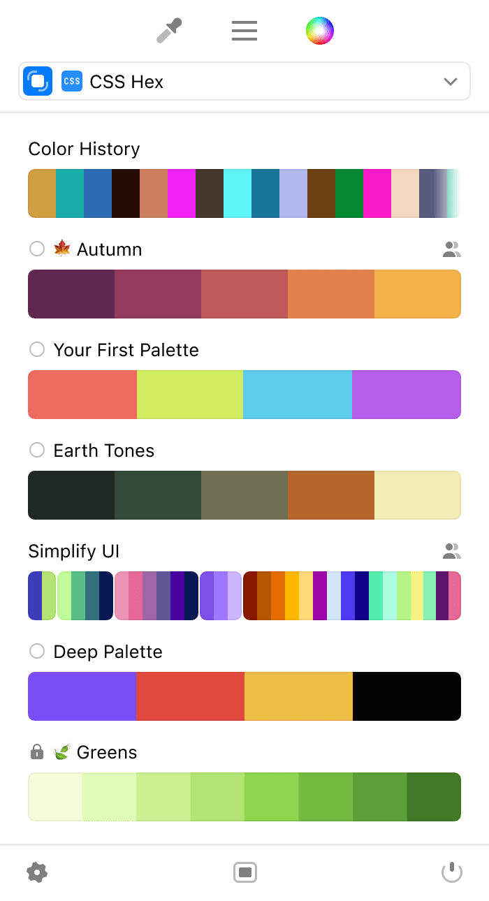
menu bar interface

Menu Bar

Edit your color palettes on the fly in our thoughtfully balanced menu bar app that offers essential functionality without being intrusive.

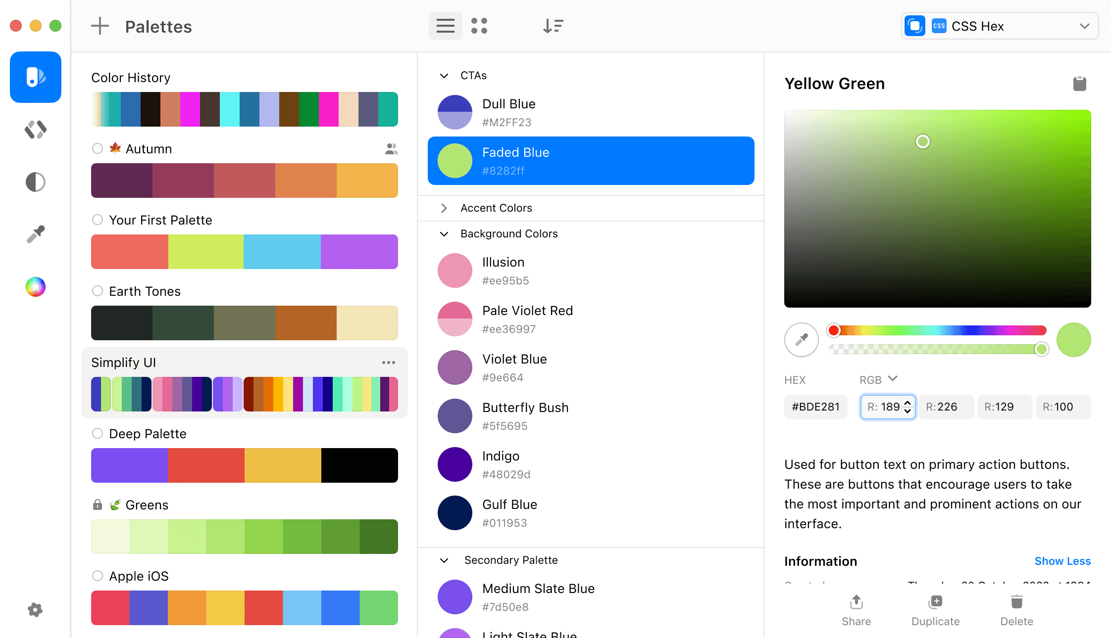
main window interface

Main Window

For more advanced color and format management, use the full native app window, which provides all the organizational tools you would expect.

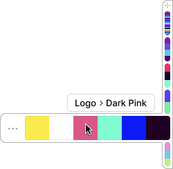
color dock interface

Color Dock

Easily access your favorite colors with our color dock. It stays visible on any edge of your screen, so you can use your colors without losing focus on your work.

Trusted by industry leaders

Professionals at these companies use Sip in their workflows

  • Google
  • Disney
  • Adobe
  • Netflix
  • Dropbox
  • Apple
  • Meta
  • Airbnb
  • IBM
  • X
  • Amazon
  • Pinterest

Precise Picker

Our new color picker allows you to quickly and easily select any color on your screen, twice as fast as before.

Using convenient shortcuts, you can pick multiple colors, create a palette as you pick, and send colors directly to your tools of choice.

Learn more about our picker

Animation of the picker

Powerful Editor

Manage your palettes, collaborate with your team, and bring your perfect colors to life. Create, edit, and share colors in a natural and intuitive way.

Menu Bar interface
Main Window interface

Editing colors is simple and enjoyable. Add descriptions to your colors and palettes for easy management.

Sip's palettes and sub-palettes provide a flexible solution for organizing colors according to modern teams' needs.

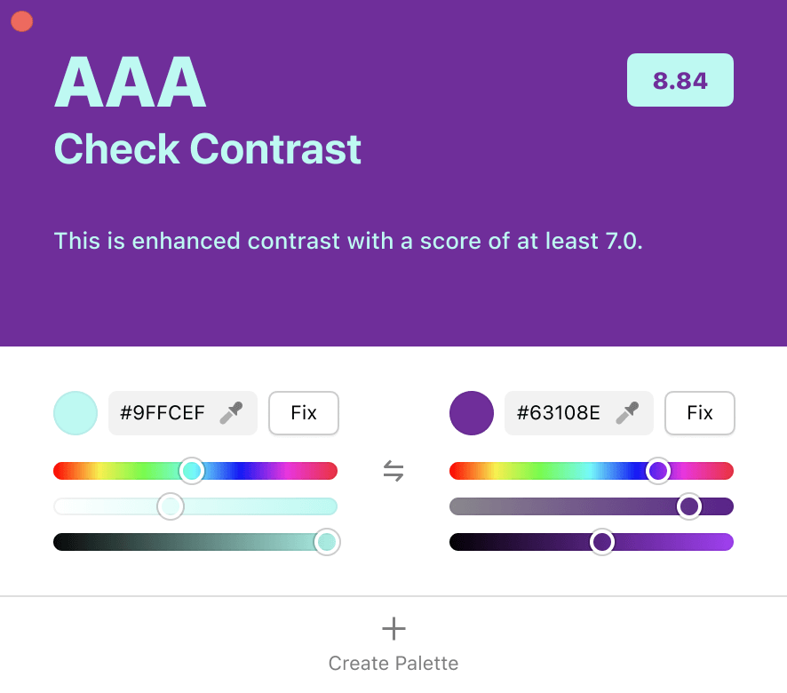
Contrast Checker

Make your design more accessible by identifying and improving low-contrast text and background colors.

Easily fix contrast issues and save the corrected colors as a new palette with just a click.

Learn more
contrast checker interface

Smart Profiles

Automatically apply the correct color profile when picking from different environments. No more mismatched colors. Just reliable, consistent results.

Learn more
smart profiles section

Accessibility

Simulate how your colors appear to people with different types of color vision, right inside the app.

Quickly toggle between modes like Protanopia, Deuteranopia, Tritanopia, and Achromatopsia to preview your palettes in real time.

Learn how to use it
accessibility section

Smarter by Design

Sip was rebuilt from scratch, resulting in a more intuitive and seamless experience with top-notch performance.

  • Window App

    A richer experience when organising your projects

  • Sub-palettes

    A flexible solution for organizing colors

  • Smart Formats

    Automatically detects your application and sets the right format

  • 2x Faster

    Retina-ready color picker

  • Descriptions

    Improved communication around content

  • Shortcuts

    Better shortcuts for more intuitive control

  • Collaboration

    Share and sync content between devices